


How to Choose Corporate Uniform Colours That Match Your Brand
You know that moment when a team walks into the room, and you instantly get a sense of the company they represent, even before anyone says a word? That is colour doing its job. The colour of a corporate uniform communicates faster than any pitch or brochure. It tells people whether the brand is serious or playful, premium or accessible, traditional or modern.
Yet despite this, many companies can be seen to regard the choice of uniform colour as a minor detail. They will choose something that is close enough to the logo to do the job, order the uniforms, and later puzzle over why the result seems a little out of sync with the brand that they have taken years to build.
So, choosing the best colour for your company’s uniform is not too difficult if you do it properly. You will find here a practical guide that helps you do just that whether you are making your first uniform order or rethinking your former choices.
Why Does Uniform Colour Actually Matter This Much?
Think about the businesses whose teams you can picture immediately. The deep red of a luxury hotel’s front desk team. The crisp navy of an airline’s cabin crew. The clean white of a hospital pharmacy. You probably did not have to think very hard, those colours are doing active branding work every single day.
Colour establishes an automatic link for the spectator. Studies in colour psychology indicate that human beings create impressions within a few seconds, with colour being one of the most important factors in making them. For a team whose members interact with clients, the uniform colour aids in the delivery of the company’s message at all times, without anyone knowing it.
The uniforms worn by teams can carry an additional internal dimension. Companies that have well designed uniforms made in their brand colours are able to behave differently owing to their uniforms. It gives a notion to the wearer about their representation and identity of organisation and that is why this topic is significant for every person working in a client-facing industry or in a visible role in the company.
Start With Your Brand, Not a Swatch Book
This is the most common mistake businesses make: they start the uniform conversation by looking at fabric colours. That is the wrong starting point. Before you look at a single swatch, you should be clear on three things:
- What feeling do you want a client or customer to have when they see your team? Trust? Energy? Calm precision? Premium authority?
- Your brand’s presentation needs to remain consistent no matter the platform either. All your visual elements, starting from the logo and the offices’ interiors to marketing materials should connect together into an overarching story.
- What does the business expect from the industry and where do you want to fit into its expectations? Following what has already been accepted can give one a quick label of confidence; abandoning those standards might turn into a distinction without a doubt.
Your answers can help you when it comes to choosing the colour scheme. For instance, a start-up in the area of fintech may want to send an impression of innovation and fast-paced work which differs greatly from the well-established law firm trying to communicate stability and authority.
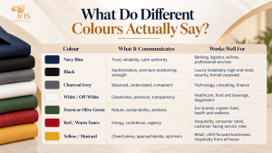
What Do Different Colours Actually Say?
Now let’s talk about what colour meanings are characteristic of the majority of businesses when making decisions about uniforms. The rules below are not strict, but they can be extremely useful as the starting point for making the right choice.
| Colour | What It Communicates | Works Well For |
| Navy Blue | Trust, reliability, calm authority | Banking, logistics, airlines, professional services |
| Black | Sophistication, premium positioning, strength | Luxury hospitality, high-end retail, security, formal corporate |
| Charcoal Grey | Balanced, understated, competent | Technology, consulting, finance |
| White / Off-White | Cleanliness, precision, transparency | Healthcare, food and beverage, diagnostics |
| Forest or Olive Green | Nature, sustainability, wellness | Eco brands, organic food, health and wellness |
| Red / Warm Tones | Energy, confidence, urgency | Hospitality, consumer retail, customer-facing service roles |
| Yellow / Mustard | Cheerfulness, approachability, optimism | Retail, child-focused businesses, hospitality front-of-house |
One thing to keep in mind is that these associations depend not on color but on hue. For example, bright cobalt blue and dark midnight navy both fall under the category of “blue” but mean drastically different things. Therefore, when dealing with any corporate uniform supplier, keep in mind that you must confirm physical fabric samples in the shade of your choice, as the displayed colors on a screen differ from dyed fabrics.
Your Brand Colour and Your Uniform Colour Are Not Always the Same Thing
This is something that trips up a lot of businesses, especially those with very specific or saturated brand colours. Your brand’s digital colour does not always translate cleanly into fabric.
There are several explanations for this: color seen on the screen is emitted, fabric absorbs it, therefore even when the screen shows bright and vivid colors. The color that you see on the screen will look different in fabric or knitwear. Also, one should mention that various skin tones affect how a person perceives the general hue of the color and this is important for making the correct choice of the clothes color when ordering uniforms for the company.
A more practical way is to deal with the color family of your brand instead of trying to get the precise shade. If your brand features dark teal, your brand uniforms do not have to be exactly of that shade. A navy garment of a darker tone of blue with a touch of teal on a collar or cuffs may look more appropriate than a complete garment of teal color.
It is important to remember that, as pointed out in the Iriswear guide on good corporate uniforms, it is crucial to examine the physical samples of your brand rather than the one from the screen. The same color can look significantly different if exposed to differently illuminated environments or fabric types.
Which Colours Work Best for Which Industries in India?
There are established colour conventions in most industries. These exist because they create the right expectations quickly, clients and customers have learned what certain colours mean in certain contexts. Here is a rough guide that works well for the Indian market specifically:
| Industry | Recommended Base Colours | How to Differentiate |
| Banking and Finance | Navy, charcoal, deep grey | A distinctive brand accent on collar, cuffs, or pocket trim |
| IT and Technology | Grey, black, dark navy | A brighter accent colour for client-facing roles |
| Hospitality and Hotels | Black, navy, white, rich jewel tones | A bespoke colour that belongs entirely to your brand |
| Healthcare and Diagnostics | White, sky blue, pale green | Department-specific accent colours within the same palette |
| Retail and Consumer | Brand-led, often bold | Seasonal accent pieces while keeping the base consistent |
| Logistics and Field Operations | High-vis yellow/orange for safety roles, navy for others | Brand colour applied to non-safety garments in the same team |
| Wellness and Spa | Soft greens, blush, cream, stone grey | A tonal accent that ties back to the brand’s colour palette |
Now, following industry convention is sensible. But if you only do that, your uniforms look like every other company in your sector. The real opportunity is in the detail: a distinctive collar colour, a contrast inner lining, a sleeve accent, or embroidery in your brand colour. The base keeps you credible; the detail makes you recognisable.
How to Use Colour to Differentiate Roles Within Your Team
This is a tangible concept that most businesses ignore. Color is one of the best methods for distinguishing people’s roles, and when it works well, it benefits everyone, i.e. customers get quicker service from the team, employees have clear understanding of their places in the hierarchy, and organization as a whole improves.
To implement it does not mean requiring radically different uniforms. Small changes perform better: other colors of collars, different colored stripes, changed sleeves, or any other tonal change of the clothes you wear. The visual image of organization remains stable; it appears to be the same uniform but performs the task of sending role signals without being obvious.
For instance, in a hotel the receptionists may use dark blue cloth with golden trim, while housekeepers wear the same dark blue without the trim and concierges wear black clothes with golden trim.
Practical Colour Considerations Specific to India
This is where general colour advice meets Indian conditions, and the two are not always the same thing.
Color fastness in Indian Climate
India’s combination of intense sunlight, humidity, and frequent washing puts fabric dye under real stress. A deep navy that looks rich and polished on day one can fade to an uneven medium blue within a year of regular wear if the fabric has not been dyed with proper colorfastness standards. When working with any uniform manufacturing company, ask specifically about dye quality and expected fade resistance, this is an easy question to skip and an expensive one to ignore.
Colour Across a Diverse Workforce
The workforce of India exhibits a remarkable diversity in terms of its visual appearance, and the same shade of colour can seem different on different individuals. With certain nuances of mustard yellow, shades of green, and rich pastel shades looking good on one person, they may appear less flattering on another. Before ordering in bulk, try the fabric from your perspective not only in the mock-ups made using your designing skills but also on the actual members of your team.
Heat and Comfort in Outdoor or Non-AC Roles
Dark colors are known to trap heat. The problem is that heat is uncomfortable for those who work outside or in places without air conditioning. For example, this includes workers in logistics, field sales people and people working on factory premises. If your brand contains dark shades, think about using lighter colors of the same brand while designing uniforms for certain jobs, as that will make it more comfortable for the workers in general.
A Simple Process to Land on the Right Colour
So how do you actually make the decision? Here is the process that works well in practice:
- List your brand’s core colours – primary, secondary, and accent colours used consistently across all brand materials
- Identify the feeling you want to lead with – check which of your brand colours maps most naturally to that feeling
- Check your industry norms – decide whether to align or differentiate, and how far
- Request physical fabric samples – never finalise based on digital mockups alone
- Test on real team members – across different skin tones, in your actual work environment and lighting
- Plan role differentiation within the palette – small accent variations, not full colour changes
- Confirm colorfastness standards with your manufacturer before placing a bulk order
At Iriswear, this is exactly the process their team works through with clients, from hospitality groups and healthcare networks to retail chains and IT companies. Being a custom uniform designer is only part of the work; understanding brand colour as a communication tool is what separates a uniform that looks right from one that actually works.
Ready to Get Your Uniform Colour Right?
Iriswear works with businesses across India to design corporate uniforms that match your brand, your team, and your working conditions, from the first brief to the final sample approval.